One of the lead generation strategies marketers and website owners love to follow is displaying popups. Because they’re quick, fit the user’s screen, and bring the event to notice much better. From a marketer’s point of view, there’s nothing to hate about pop-ups.
However, if you ask website visitors, most of the time, you’ll hear them saying, “Ugh! Another pop-up,” or “this is so annoying,” or perhaps, “no man, not again, I’m too tired to see all this.” This is the story of popups created by website owners who were too busy with their marketing thing and forgot about user experience and web designing practices.
And if you choose to follow the same road, your popups could end up like the above exasperations. Popups can be annoying and make someone leave your website right at the moment they arrive. However, if you follow the popup best practices I will show you in this article, you can save your popups and, with that, all the popup strategies.
Without further ado, let’s get started.
Why Websites and Publishers Use Popups?
Despite their reputation as annoying, popups’ bright side is that they convert or have a higher CTR than any ads. Websites like Entrepreneur saw an about 86% and 162% increase in their subscription and sales, respectively.
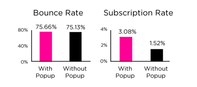
In addition to conversion, users also prefer popups because they present an event’s information much better. As well as they increase the possibility of receiving a higher number of leads. Digital Marketer, a profound online marketing company, generated 2,689 Leads in 14 Days Using “On-Site Retargeting” that included popups.
Thus, it means popups aren’t dead yet (as you may find people saying that) if you apply best popup practices. And once you do that, you’ll see your popup will provide more benefits, as mentioned below, than only a good conversion rate or building an email list.
A Mouthful of Pros Using Popups
- Run offer’s A/B testing.
- Share promotions on selective locations.
- Generate leads from those who are leaving the site.
- Can Reduce website abandonment.
- Promote offers based on users’ activity.
- Gather information to improve your products or services.
- Detect Adblock extensions and improve ad revenue.
There are Fewer Cons, But They’re Enough To Sadden The Visitors
- If you use bad practices, popups are more than annoying.
- Interrupts the users
- Under heavy marketing influence, they increase the Bounce rate.
- Could damage brand reputation due to aggressive nature.
- If shown on mobile devices without following proper guidelines, Google can penalise your website.
As you’ve seen the cons, it’s time we look at popup rules that can help you build popups that won’t scare off your visitors.
How to Display Popups Without Annoying Visitors
1. Timing Is Important (Trigger Popups at the Right Time)
Whether it’s displaying popups or arriving at a meeting, timing is crucial. If you arrive late or early, you either make a wrong impression, miss something crucial, or lose all your energy while waiting for others to arrive.
The same is valid with popups. If you show them too early, it will annoy people as they’d be about to get involved with the content, and by showcasing the popup, you’ll disturb their attention.
Whereas, if you show them after a very long time, then it’s possible people would have already left your site without seeing it.

Therefore, when you show popups, prioritize their timing. And to do that, what you can do is,
- Analyze your audience, such as what time throughout the day or week you have the most visitors.
- Don’t trigger the popup right after the user has arrived —on immediate page load.
- Trigger it when the user has reached the middle of the content utilizing a scroll popup.
- Or, if you don’t want to get into the user’s way, you could create elegant, to-the-point exit-intent popups to target your visitors right when they are about to leave your site and show them the right message that will compel them to take action.
The above points will help you trigger your popup at the right time, neither too early nor too late.
2. Segment Visitors – Personalize the Content
Different people, different tastes, so it’s not wise to show the same popup to all the website visitors because an irrelevant thing will only annoy people and nothing more. Therefore, to avoid irrelevancy, you can personalize the content, and for that, you can segment visitors.

The following popular tactics could be practiced to segment users to display different popups,
- Segment New & Returning Users.
- Segment Users Based on Referrals — Different popups for users coming from different URLs such as Social Media Networks and Organic search.
- Based on Device Type.
- And Geolocation Targeting.
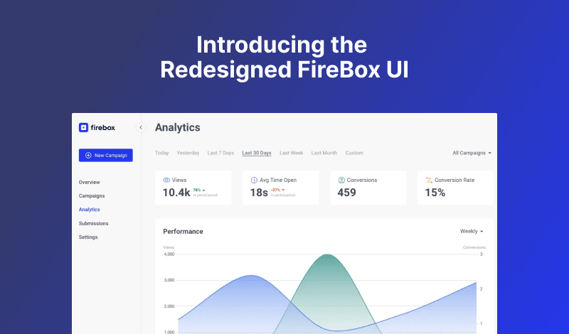
For popups to perform at their best potential, user segmentation is crucial, and for that, it’s essential that you use a smart popup builder like our WordPress popup plugin, FireBox.
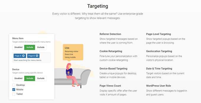
It’s a free and easy-to-use popup maker, and if your website is on WordPress, then FireBox is the WordPress popup plugin you need to display popups based on user segmentation. It allows you to create popups based on different segmentations like Referral, Cookie retargeting, Device types, Geolocation, Date, Page-level, and more.
3. Match Popup Design With the Design of Your Site
By displaying popups, you’re promoting exclusive offers and user benefits, that’s excellent, but after benefits, the design comes into the role. If the representation isn’t eye-catching, you can’t serve it well no matter how tasty your meal is. The same applies to a popup.
- Its design should complement the site’s design. Otherwise, it will create non-uniformity, which only distracts the user and nothing more.
- At the same time, it should distinguish itself from your website’s content. You don’t want the user to get lost and try hard to understand the popup’s content or purpose.
- And it should match the colors on the page. This will make the popup less intrusive and more elegant, soothing to the eyes.
4. Include a Concise Message in the Popup
If you can’t hook your users with the message, you can’t hook them with your popup’s design. As much as the design is crucial, the same applies to your popup’s message. Therefore, when you use the popup builder to create a popup, make sure you keep the content concise and exciting enough. So, as soon as they look at the popup, they get motivated to check out what it says.
5. Include a Distinct Call-to-Action
What allows users to take action on the popup is the CTA. It helps them understand what they’re supposed to do next. What’s the entire purpose of theirs to see the popup. So, it has to be distinct from the main popup content, allowing users to easily decide and take further action.
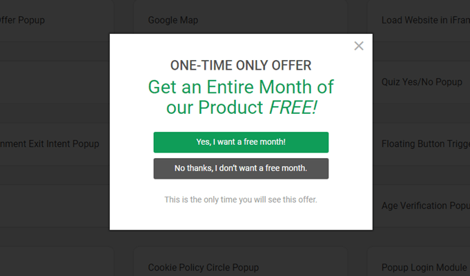
To make the CTA distinct, you can try the following
- Apply high contrast.
- Align it properly.
- Use an easy to read and engaging font family.
- Should match the website’s styles.
- Indicate benefits like Flat 40% OFF.
- The width shouldn’t be too long or small.
6. Make Popup Easy to Close
Yes, showing a close icon or button on the popup increases the chances of its ineffectiveness. But, that’s the best thing about user experience and building trust. If you hide the closing element or make it hardly visible, you take users the liberty to decide whether they want to try your services or not. Popup’s user-friendliness is as essential as your offers and benefits.
Plus, if you don’t provide them with a closing element, what would they do if they don’t want your offer or service? They’ll close the window. Thus, increase in bounce rates and later decrease in Google Rankings.
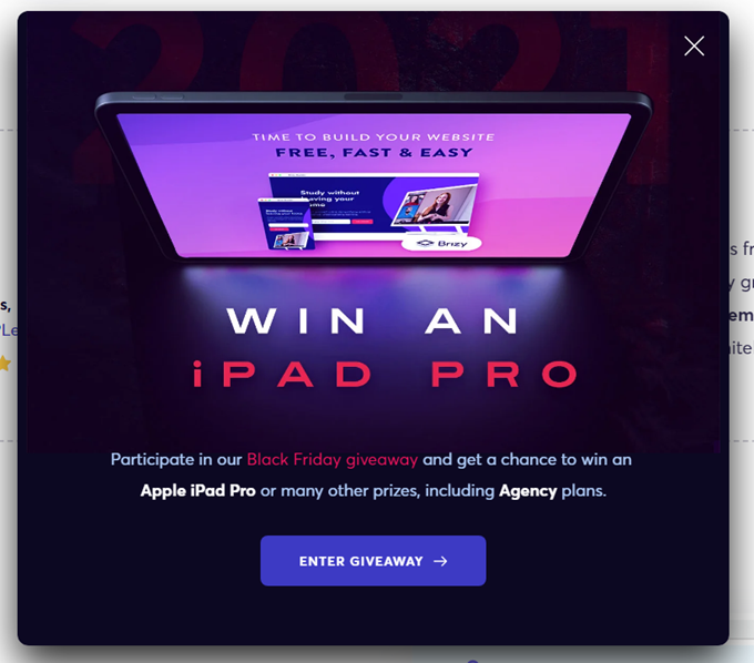
So, just like CTA, make your popup’s closing element (button or icon) obvious with large size and high contrast. Also, don’t try too much here; just go simple and effective.
7. Optimize for Mobiles
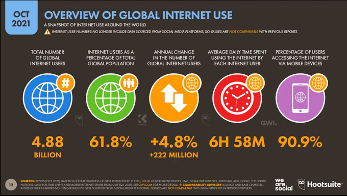
It’s tempting to show popups on mobile phones when 90.9% of users from 4.88 billion internet users are active on mobile devices, which is huge.
However, Google could penalize the site if you forget to use the popup builder to optimize the popups for mobile devices. According to Google, the following popup types are appropriate to display. And if they don’t fit the following criteria, then the whole site could face the consequence.
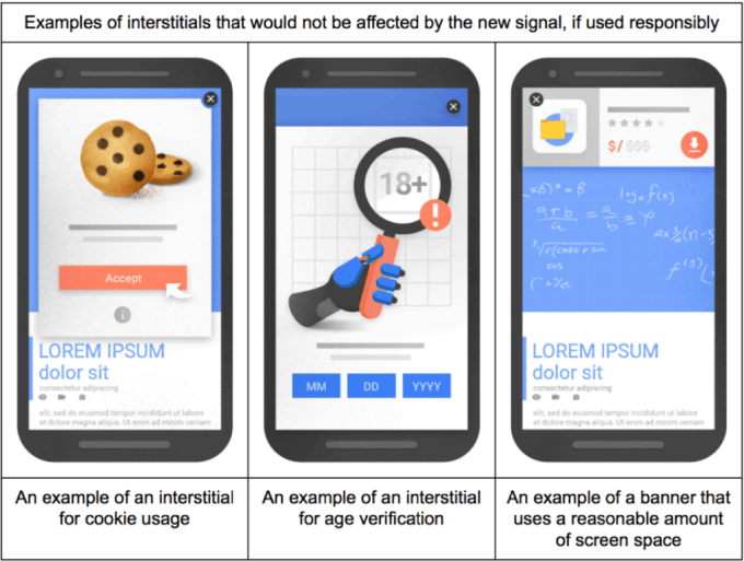
Hence, it’s crucial to optimize your popups for mobile, and the best you can do is,
- Make them highly non intrusive.
- Use a reasonable amount of screen space, don’t cover the whole area.
- Make them easy to close or dismiss.
- Apply only one trigger from many.
- Prefer lesser use of images.
8. Don’t Ask Too Much Information
When you’re going to build a popup to collect user information with the help of opt-in fields, try not to ask for too much information. People find filling out a form is a dull task because it requires their time, and people look for quick solutions.
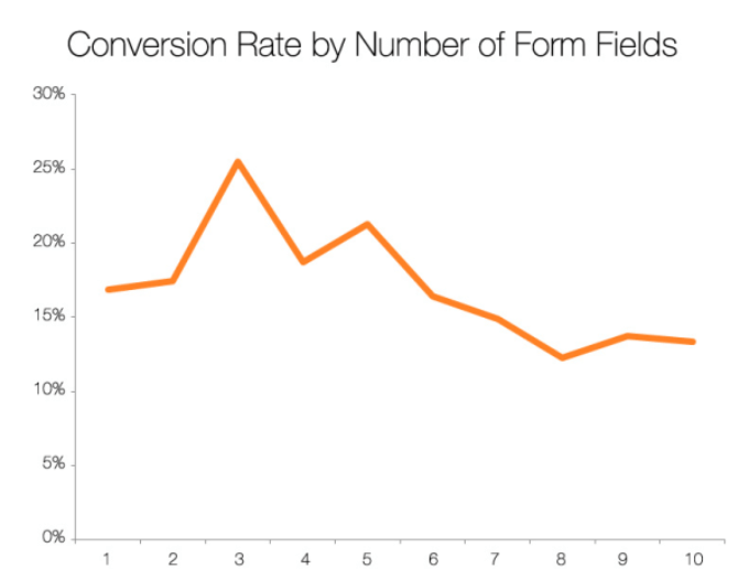
Moreover, it’s also found that popups with 2 or fewer input fields perform better. Therefore, when you create a popup with an opt-in form, keep the number of fields to a minimum.
Conclusion
Whether you want to display popups on a personal website or business, you can build popups that won’t annoy users by following the above best practices. Under these practices, the popups you’ll create would be highly engaging and improve conversion rates.
However, what’s challenging is that what tool you should use to accomplish all these practices. Well, for WordPress users, the good news is that they can utilize the features of our FireBox popup builder. It’s an intuitive WordPress popup plugin developed by us to provide you with many different options to apply all the best popup rules.
Whether you want to create mobile popups or apply segmentation, the plugin has got you covered. All you have to do is make the purchase to unlock every outstanding feature of it. Go, try it now today, and let us know what your experience was.



0 Comments