Often regarded as the biggest shopping extravaganza of the year, Black Friday is an event that retailers eagerly anticipate. It’s a day when shoppers pursue unbeatable deals, and businesses are vying for their attention and hard-earned dollars. In this highly competitive landscape, the ability to capture your audience’s attention swiftly and effectively can make all the difference.
This is where the power of Black Friday popups comes into play. They are more than just website embellishments; they are dynamic marketing tools capable of significantly enhancing your sales during this critical retail event. When executed creatively and strategically, these popups can transform casual visitors into eager buyers, driving conversions and boosting your revenue.
In this article, we will delve into the world of Black Friday popups for WordPress and unveil a treasure trove of creative ideas that can elevate your marketing game. We’ll explore innovative popup strategies that have proven successful, each with the potential to captivate your audience and drive them to take action. These popup ideas range from creating a sense of urgency with countdown timers to recovering abandoned carts with exit intent popups and much more.
So, if you’re looking to make the most of Black Friday and supercharge your sales by curating exclusive Black Friday deals for your products, stay with us as we unveil these creative Black Friday popup ideas. These ideas can turn your WordPress site into a magnet for holiday shoppers, helping you stand out in a crowded marketplace and secure your slice of the Black Friday sales pie.
Table of Contents
How to Use Black Friday Popups
Collect Emails Before Black Friday
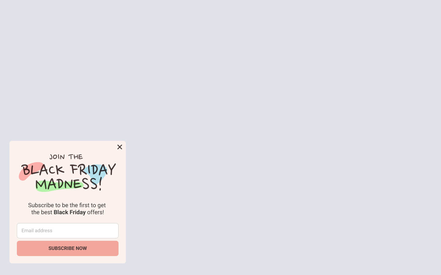
Are you looking to boost your email list before the big Black Friday sale? This example, strategically positioned in the bottom left corner, is the perfect tool for the job. Crafted to make a powerful impact, this eye-catching popup is triggered on page load to capture the attention of your visitors right away.
This popup features a sleek and uncluttered design and a single, user-friendly email input field. This example has made it easy to connect with your audience by simply requesting their email address. In exchange, this popup promises to keep them in the loop and notify them as soon as the Black Friday madness begins.
The vibrant colors not only make this popup visually appealing but also add a touch of excitement to your Black Friday preparations. With a compelling copy that says “Join the Black Friday Madness,” your visitors won’t be able to resist subscribing to your email list, ensuring that they’re the first to know when the sale of the year starts.
This attractive and effective popup template captures email addresses and builds anticipation for your Black Friday deals. It’s a fantastic way to engage your audience and drive more sales on the big day!
Welcome First Time Visitors
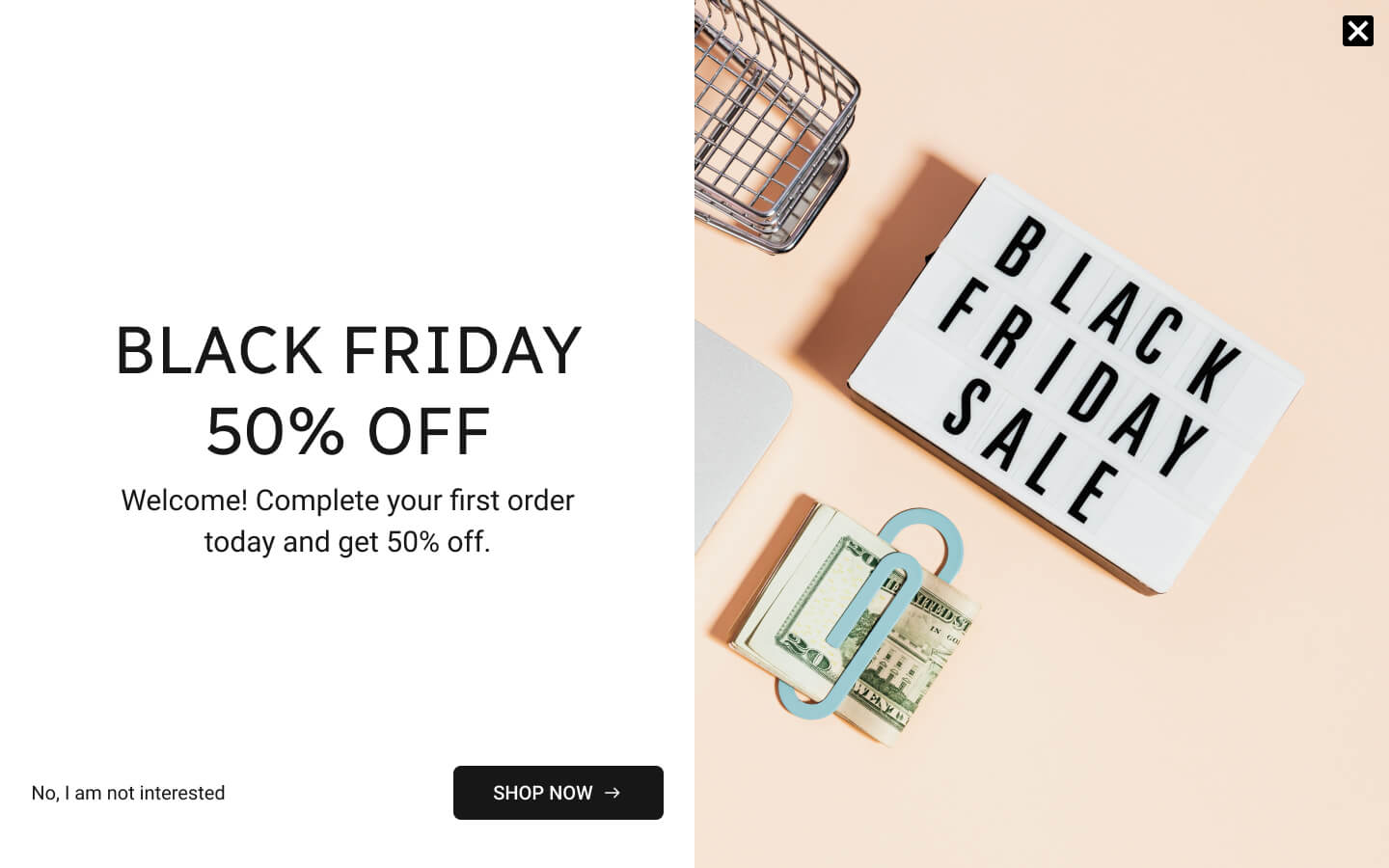
For your first-time visitors, this fullscreen popup is your ultimate Black Friday deal announcement. Designed to captivate and convert, it’s triggered on page load exclusively for those brand-new to your website, thanks to the innovative New vs Returning Targeting Rule.
The layout of this popup is divided into two distinct columns to provide a visually appealing and informative experience. On the left, a prominent, attention-grabbing headline boldly proclaims, “BLACK FRIDAY 50% OFF“. This announcement leaves no room for ambiguity, ensuring visitors know they’re in for a fantastic 50% discount on their first order. Complementing the discount, a clear and compelling call-to-action (CTA) button labeled “SHOP NOW” encourages users to explore your offerings and take full advantage of this limited-time offer. All of this is set against a pristine white background, enhancing the visibility and impact of the message.
To ensure a seamless user experience, this fullscreen popup includes not one but two closure options. Apart from the classic top-right close button, an additional link reads, “No, I am not interested.” This thoughtful touch allows users to easily dismiss the popup, respecting their preferences and providing a user-friendly interaction.
With this fullscreen popup, you’re all set to make an unforgettable impression on first-time visitors and entice them to explore your offerings. Don’t miss out on this opportunity to boost your Black Friday sales. If you want to learn how to create a fullscreen popup in your WordPress, visit our article for detailed guidance!
Recover Cart Abandonment
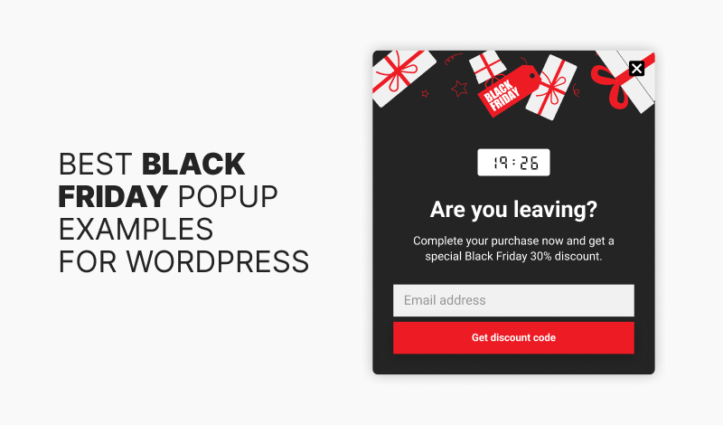
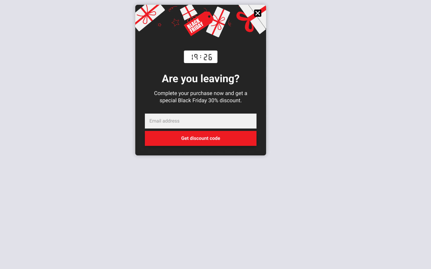
Introducing the “Cart Saver” exit-intent popup designed to combat cart abandonment. This example implements exit-intent technology, strategically triggered when a visitor is on the brink of leaving the checkout page. Focusing exclusively on this page optimizes the chance of recovery for your e-commerce site.
The primary goal of this pop-up is to retain visitors and halt cart abandonment. In exchange for their attention, this example requests their email addresses. To appreciate their cooperation, it offers a special Black Friday 30% discount code.
Suggested Article: Exit-Intent Popups: 5 Tactics to Double Your Conversions
The content of this exit-intent popup is clear and persuasive. The heading “Are You Leaving?” directly captures the visitor’s attention. The subtitle, “Complete your purchase now and get a special Black Friday 30% discount“, reinforces the value of staying on the page. Below this text is an opt-in form, which is instrumental in obtaining the visitor’s email address to deliver the promised discount coupon.
This example incorporates a countdown timer at the top of the popup to add a sense of urgency. This visual element urges visitors to act swiftly and purchase before the exclusive Black Friday offer expires.
If you’re utilizing platforms like MailChimp or Brevo, you can effortlessly transform this example into a MailChimp or Brevo popup for your WordPress website using the FireBox WordPress popup plugin. This seamless integration guarantees that the email addresses you gather are used effectively to nurture leads and deliver attractive offers.
Drive Traffic to Hot Black Friday Deals
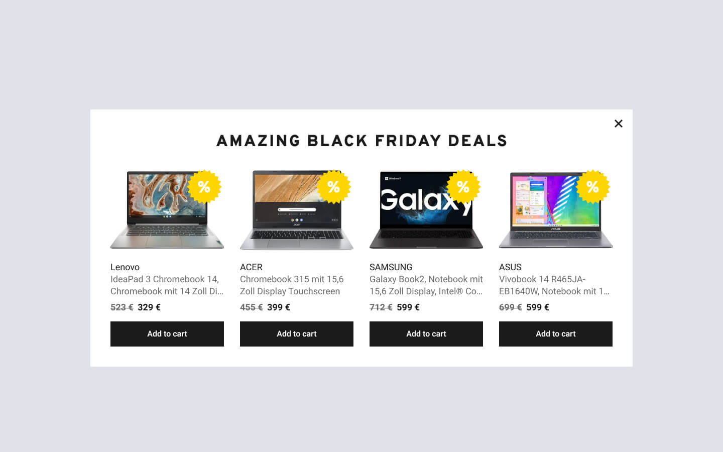
The following popup example is designed to boost traffic to enticing Black Friday deals. Its primary objective is to upsell and effortlessly promote complementary products based on the user’s current product category, encouraging them to explore additional items that align with their interests and preferences.
This popup showcases four related products with a prominent “Add to Cart” button. It is specifically tailored for WooCommerce sites, as the popup’s content is generated using the WooCommerce Product Block. Furthermore, it is set to trigger automatically upon page load.
To learn more about leveraging personalized WooCommerce popups to increase your WordPress site sales, please refer to our article: Personalized WooCommerce Popups: The Key to Increasing Sales on Your WordPress Site.
Utilize Cross-Sell and Upsell Popups
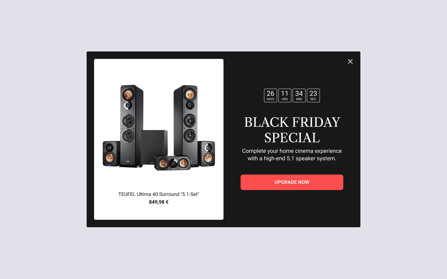
The following popup example enhances upselling opportunities by showcasing recommendations for higher-end or complementary products tailored to the specific item users are currently viewing. This strategic approach boosts the average order value and is optimized for WooCommerce sites.
The pop-up features a prominent headline exclaiming “BLACK FRIDAY SALE” to capture immediate attention. At the top, a countdown timer creates a sense of urgency, motivating users to act swiftly. To the left, an enticing image of the promoted upgrade product is displayed alongside its title and price. A clear call-to-action (CTA) labeled “UPGRADE NOW” encourages users to take advantage of the offer.
This popup utilizes the WooCommerce Current Product condition, ensuring it only appears on specific product pages where it is most relevant.
Intrigue Visitor with Popup Teasers
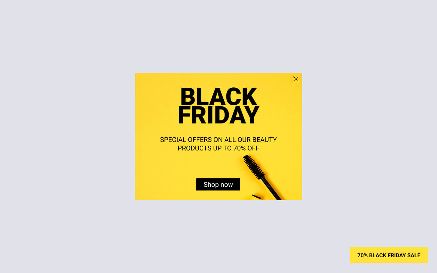
The following popup example is designed to captivate users with an intriguing teaser button positioned at the bottom right corner of the screen. This button is labeled “70% Black Friday Sale“. When clicked, it opens the main popup at the center of the screen, providing more details about the Black Friday sale.
The uniqueness of this popup lies in its floating button, which automatically appears on the page load and follows the user as they scroll down the page, ensuring that the visitor doesn’t miss this exciting offer. Moreover, after the user closes the main popup, the teaser button reappears, giving them a second chance to take action.
This approach is particularly effective for popups that load as the user scrolls, providing a compelling opportunity to engage users. The pop-up features a vibrant yellow background with black text, creating a visually appealing and attention-grabbing design.
Suggested Article: How to Create a Popup That Opens on a Button Click in WordPress
Increase Cart Value with a Free Gift
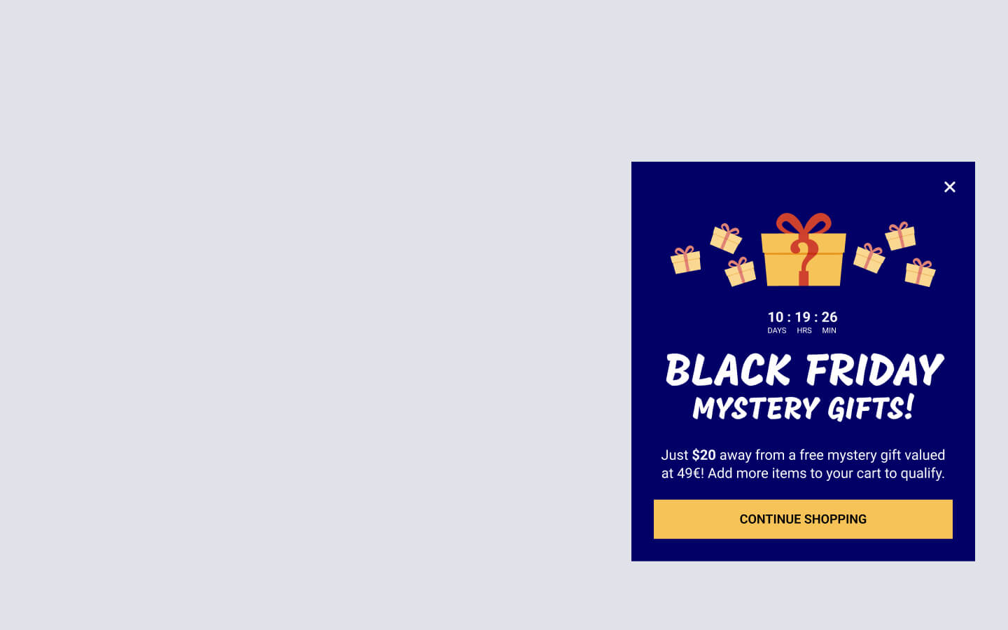
The following popup is a powerful tool for boosting cart value by offering a tempting gift. It operates under the premise of “Spend $X and Get a Free Gift“, compelling users to enhance their shopping carts by presenting enticing popups that promise gifts or rewards once they reach a specific spending threshold. This strategy motivates them to add more items to their cart, ensuring they enjoy the added benefit.
The popup greets visitors with the captivating headline “Black Friday Mystery Gifts!” and an inviting subheading that reads, “Just $$$ away from a free mystery gift valued at $$$! Add more items to your cart to qualify.” A countdown timer enhances the urgency, encouraging customers to act promptly.
This popup is set to trigger automatically upon page load, but only when the user’s cart total is below the required threshold for the gift. This is accomplished using the Amount in Cart popup condition, ensuring users receive the incentive when they need it most.
The ideal solution for those interested in creating WooCommerce popups based on products in the cart or cart total amount is the FireBox WordPress popup plugin. This versatile tool empowers you to craft engaging and effective popups tailored to your specific needs, such as enticing users with tempting offers like gifts or incentives to boost their cart value.
Advertise Limited Product Stock
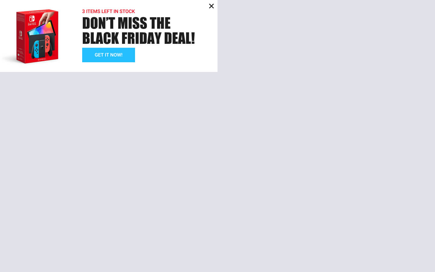
The next popup example serves as a potent limited product stock alert. This approach leverages the psychology of urgency and scarcity, presenting popups that promptly notify users about a product’s dwindling availability or when it’s about to run out of stock. This strategy expedites decision-making and compels users to take immediate action.
The popup is designed to trigger automatically on any product page where the stock falls below a certain threshold. This precision is achieved through the WooCommerce Current Product Stock condition. At the top of the popup, it prominently displays “X Items left in stock“, emphasizing the limited quantity. A bold headline below states, “Don’t miss the Black Friday Deal“, compelling users to consider the offer seriously. An attention-grabbing CTA button labeled “GET IT NOW” is positioned beneath the headline.
Upon page load, this minimal and effective popup will appear automatically at the top left corner of the screen, maximizing its impact and ensuring users don’t miss the opportunity.
Offer Reach Free Shipping
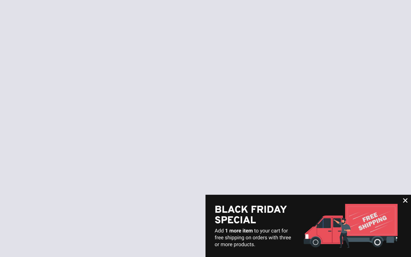
This example of a slide-in popup is your go-to tool for promoting your enticing Black Friday free shipping deal. Its main purpose is to encourage users to reach the free shipping threshold by displaying an eye-catching notification that informs them of the remaining amount needed to qualify for this fantastic offer. Doing so motivates them to add more items to their cart and ultimately save on shipping costs.
This “free shipping motivator” slide-in popup makes a bold statement with its prominent heading: “BLACK FRIDAY SPECIAL“. Below, a persuasive subtitle reads, “Add x more items to your cart for free shipping on orders with three products or more“. This message communicates the exclusive benefit users can unlock from this Black Friday deal.
Designed for a minimalist and discreet presence, this popup automatically appears at the bottom right corner of the page upon loading. Its unassuming yet eye-catching design conveys essential information without disrupting the user’s shopping experience.
To create a free shipping bar in WordPress, visit our detailed article.
Frequently Asked Questions
What is the best WordPress Popup plugin to create Black Friday popups?
Elevate your Black Friday marketing with FireBox, the best WordPress popup plugin for crafting eye-catching popups. Featuring a user-friendly interface and a diverse selection of pre-designed Black Friday-themed popup templates, FireBox empowers you to effortlessly create, personalize, and deploy visually stunning popups that will impact your website visitors. FireBox is your secret weapon for transforming your Black Friday marketing efforts into an enchanting success story!
What makes a popup successful?
Popup success hinges on relevance, timing, and user-friendliness. For a positive user experience, ensure your popups offer value, appear at the right moment, and are easy to dismiss.
When should I start promoting my Black Friday deals?
To build anticipation and capture early shoppers, begin promoting your Black Friday deals well in advance, ideally a few weeks prior. This allows you to generate buzz and maximize your reach before the big day.
How do I ensure my Black Friday popups don’t annoy visitors?
To prevent annoyance, use popups sparingly, employ exit-intent technology, ensure easy dismissal options, and ensure popups are relevant to the user’s browsing context. Testing and user feedback can also help refine your approach.
Should I use exit-intent popups for Black Friday promotions?
Yes, using exit-intent popups during Black Friday can help re-engage potential customers and reduce cart abandonment, but ensure the popup message is relevant and not intrusive.
What are the common mistakes to avoid when using Black Friday popups?
Common mistakes to avoid with Black Friday popups include overloading your WordPress site with too many popups, displaying irrelevant or intrusive content, not optimizing for mobile users, and neglecting to test and refine your popup strategies. Additionally, failing to provide a clear and easy exit option for users can also be a mistake to avoid.
What other seasonal campaigns should I consider for my marketing strategy?
Consider campaigns like Valentine’s Day, Halloween, Cyber Monday, Back-to-School, Christmas, Easter, or industry-specific seasons based on your audience and business niche. Tailor your choice to align with your industry and target audience for the best results.


0 Comments