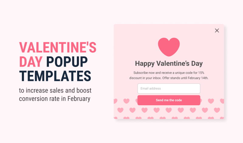
Valentine’s Day is a crucial holiday for online retailers. With many shoppers looking to buy gifts for their loved ones, it’s an opportunity to increase sales and boost conversions. One way to do this is by using popups on your site.
Popups are a great way to grab visitors’ attention and showcase special offers, discounts, and promotions. This article will showcase some excellent Valentine’s Day popup templates you can use to boost your conversions this February.
Whether you want to create a sense of urgency, offer free shipping, or generate leads, these popup templates will help you make the most of the holiday season. So, if you want to drive sales and increase conversions on Valentine’s Day, keep reading!
Table of Contents
- Promote Valentine’s Day Limited Sale With a Countdown Timer Popup
- Grow your Email List by Announcing Upcoming Valentine’s Day Sales with a Form Popup
- Offer a Discount to New Visitors on Valentine’s Day with an Opt-in Popup
- Announce Valentine’s Day Giveaway Campaign with a Sticky Bar
- Decrease Cart Abandonment on Valentine’s Day with an Exit Intent Popup
- Offer a Valentine’s Day Gift Card using a Floating Bar
- Engage Visitors on Valentine’s Day with a Yes / No Popup
- Promote Free Shipping on Valentine’s Day with a Floating Bar
- Promote your Return – Refund Policy on Valentine’s Day with a Page Load Popup
- Encourage People to Follow on Valentine’s Day with a Slide-in Popup
- Promote Valentine’s Day Sale with a Heart-Shaped Popup Banner
Promote Valentine’s Day Limited Sale With a Countdown Timer Popup
One of the biggest challenges e-commerce businesses face is driving sales during the Valentine’s Day season. With the holiday falling during the typically slower winter months, it can be difficult to entice shoppers to purchase. One effective solution to this problem is using a countdown timer popup to promote a limited-time Valentine’s Day sale.
The critical elements of this popup case, such as the lightbox design and automatic page load trigger, make it easy to catch shoppers’ attention as soon as they land on your website. The central positioning of the popup also ensures that it will be noticed. The copy, “Valentine’s Day deals you can’t miss! Limited time offer,” creates a sense of urgency and exclusivity for visitors. Including the discount coupon code directly in the popup makes it convenient for shoppers to redeem the offer.
The countdown timer adds a layer of urgency to the popup, encouraging shoppers to take advantage of the sale before it ends. The CTA link button with the label “Show Now” makes it easy for shoppers to navigate the products page. Additionally, using vivid colors in the popup design can help it stand out and grab attention.
Grow your Email List by Announcing Upcoming Valentine’s Day Sales with a Form Popup
Growing your email list is crucial for any e-commerce site, and Valentine’s Day is the perfect opportunity to do so. This template is designed to help you announce your upcoming Valentine’s Day sales and collect email addresses from your visitors.
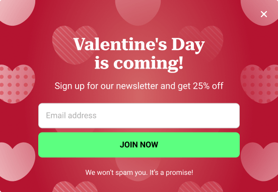
The key element of this popup template is triggered automatically on page load, positioned at the center of the screen to ensure maximum visibility. The copy, “Valentine’s Day is coming! Sign up for our newsletter and get 25% off,” is designed to entice visitors to sign up. The opt-in form is simple, with only two fields: Full Name and Email Address, and a clear call-to-action button labeled “Join Now“.
The template includes the text “We won’t spam you. It’s a promise!” below the form to assure visitors that their information will be kept safe and not used for any unwanted communications. Finally, the backdrop makes the popup easily dismissable by clicking anywhere outside the popup, which can be an essential feature for visitors who may find popups annoying.
Vivid colors make the template stand out and grab the visitor’s attention. The best thing is that every popup element is easily changed using our WordPress Popup Plugin, FireBox. It also has integrations with popular marketing apps like MailChimp and SendInBlue if you want to sync form submissions with your favorite app.
This template will help you grow your email list and notify visitors of your upcoming Valentine’s Day sales, increasing conversions and sales. It’s easy to use and customize, making it an excellent option for any e-commerce site.
Offer a Discount to New Visitors on Valentine’s Day with an Opt-in Popup
E-commerce businesses need help to acquire new customers and drive sales during Valentine’s Day. One way to accomplish this is by offering a discount to new visitors through an opt-in popup.
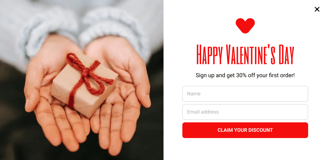
This opt-in popup is triggered automatically on page load and positioned at the screen’s center to ensure maximum visibility. The copy on the popup reads, “Happy Valentine’s Day! Sign up and get 30% off your first order!” This message is clear and to the point, and the discount offer will catch new visitors’ attention.
The popup is shown only to first-time visitors, meaning returning customers will not be bothered by the popup, resulting in a better user experience. In addition, the opt-in form includes two fields: Name and Email Address, which are easy to fill out, ensuring a high rate of form completion.
The CTA button is labeled “Claim Your Discount,” which is clear and actionable. The user will receive the coupon code to their email address after the form submission, which is done in the background using AJAX. This ensures no unnecessary redirections and saves bandwidth on low-speed connections.
Overall, this use case offers a simple yet effective solution to boost sales and acquire new customers during Valentine’s Day. It incentivizes new visitors to sign up and purchase while providing a smooth user experience.
Visit How to add a Free Email Opt-in Popup to WordPress to learn how to create this kind of popup on your WordPress site for free!
Announce Valentine’s Day Giveaway Campaign with a Sticky Bar
Announcing a Valentine’s Day giveaway campaign with a sticky bar is a great way to drive traffic to your landing page and increase conversions. One of the main issues that e-commerce sites face during the Valentine’s Day season is a need for more engagement and conversions. Using a sticky bar, you can grab the attention of your visitors, drive them to take action, and effectively reduce your site’s bounce rate.
The sticky bar will be positioned at the top of the screen and triggered a few seconds after the page has fully loaded. This placement allows for maximum visibility without being overly distracting or aggressive. In addition, the bar is configured to be shown on the homepage only so as not to bombard your users every time they visit your site.
Using a floating bar instead of a traditional popup is beneficial because it is less distracting and aggressive. The bar will follow the user while they scroll down, but it will be easily dismissable by clicking on the closing button. This allows visitors to easily remove the bar if they are not interested while still giving them the option to enter the giveaway at a later time.
The bar includes a prominent link button labeled “Enter to win” that redirects the user to the giveaway’s landing page. This makes it easy for visitors to take action, read more information and enter the giveaway. Additionally, the floating bar includes a countdown timer to increase the sense of urgency. This will encourage visitors to take action before the giveaway ends.
Announcing a Valentine’s Day giveaway campaign with a sticky bar is a great way to drive engagement and conversions on your e-commerce site. The floating bar placement, prominent link button, and countdown timer all work together to grab the attention of your visitors and encourage them to take action.
If you’re using WordPress, you can create a sticky floating bar in WordPress with a few clicks!
Decrease Cart Abandonment on Valentine’s Day with an Exit Intent Popup
Cart abandonment is a common problem for e-commerce businesses, especially during peak shopping seasons like Valentine’s Day. One way to combat this issue is by using an exit intent popup. This type of popup is triggered right before a user is about to leave your site and can be used to incentivize them to complete their purchase by offering a discount or promo code.
This popup case is a typical lightbox popup triggered using exit intent technology. This means the popup will appear when users move their cursor outside the browser window. If you’re using WooCommerce, you may also be interested in our 7 Hacks to Reduce Shopping Cart Abandonment in WooCommerce guide.
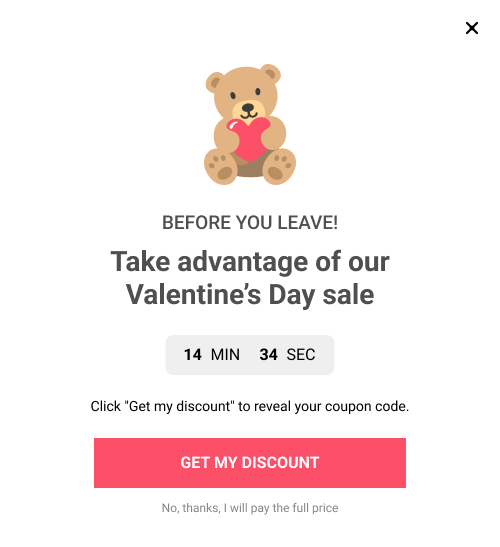
The popup will only be shown on the checkout page, ensuring it targets users most likely to abandon their cart. In addition, the copy used in the popup, “Wait! Before you leave, take advantage of our Valentine’s Day sale“, is designed to grab the user’s attention and entice them to take advantage of the offer.
In addition, the popup includes a prominent button labeled “Get My Discount“, which, when clicked, will reveal the coupon code right in the popup. This makes it easy for users to redeem the discount and complete their purchase. To increase urgency, a 15-minute evergreen countdown timer is included in the popup, encouraging users to act fast before the offer expires.
Overall, using an exit intent popup with a targeted message and a sense of urgency effectively decreases cart abandonment on Valentine’s Day. In addition, it allows e-commerce businesses to incentivize users to complete their purchases and boost sales.
Offer a Valentine’s Day Gift Card using a Floating Bar
Valentine’s Day is a busy time for e-commerce stores, but it can also be challenging to drive traffic to specific product pages, like gift cards. Floating bars can help solve this problem by drawing attention to your gift card landing page and encouraging users to take action.
The floating bar layout is an effective way to grab attention without being intrusive. Positioned at the top of the screen, it will be the first thing users see when they visit your website. Additionally, by triggering the popup a few seconds after the page has fully loaded, you can ensure that users have had a chance to engage with your website before being presented with the offer.
The background color of the popup will be a catch color in the context of Valentine’s Day. The copy “Show your love with a Valentine’s Day gift card from our store!” clearly communicates the intent of the popup and creates a sense of urgency. The prominent link button labeled “Shop Now” will make it easy for users to take action and be directed to your Gift Cards product page.
Floating bars to promote gift cards on your site during Valentine’s Day is a great way to drive traffic to a specific product page, increase conversions and boost sales. The floating bar design is non-intrusive and attention-grabbing, the trigger timing is perfect, the background color and the copy are on point, and the prominent button makes it easy for users to take action.
Engage Visitors on Valentine’s Day with a Yes / No Popup
Valentine’s Day is a crucial time of the year for e-commerce businesses, as consumers look for the perfect gifts to show their loved ones how much they care. However, driving traffic to a specific landing page can be challenging.
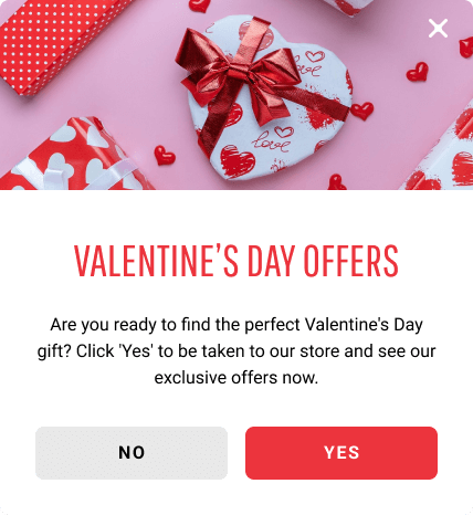
This use case utilizes a Yes/No popup, an effective way to engage with visitors and drive traffic to a specific landing page. The critical elements of this popup are the 2 CTA buttons, “Yes” and “No” that give the user a choice and provide a clear path for the next step. Clicking “Yes” will redirect the user to the landing page, while clicking “No” will close the popup and prevent it from reappearing.
The popup is positioned at the top center of the screen, making it highly visible and difficult to miss. It is triggered on user inactivity, meaning it will only appear when the user is found to be idle. This is a great way to catch the user’s attention without being too aggressive. To avoid overwhelming the user, limiting the impressions per user of the popup is recommended.
The pop-up has a catchy background color and a beautiful aesthetic image that will grab the user’s attention during Valentine’s Day. The copy, “Are you ready to find the perfect Valentine’s Day gift?” is clear and to the point, encouraging the user to take action.
This use case effectively drives traffic to your landing page while providing a user-friendly and non-intrusive experience. The Yes/No popup is a great way to engage with visitors and encourage them to take action. At the same time, the positioning, triggering, and impressions per user limit prevent the popup from being too aggressive.
Promote Free Shipping on Valentine’s Day with a Floating Bar
Are you looking to drive more sales and stand out in the crowded marketplace? One effective solution is to offer free shipping on Valentine’s Day. Not only does this incentivize visitors to make a purchase, but it also sets your business apart from competitors who may need to offer free shipping.
One way to promote this offer is with a floating bar. The bar will be sticky at the top of the screen and automatically triggered a few seconds after the user lands on the page. This placement ensures that the offer is evident and easy to access. Additionally, using a catchy background color and a beautiful aesthetic image in the context of Valentine’s Day helps grab attention and create a sense of urgency for the user.
The copy for the floating bar should be clear and concise, emphasizing the offer’s benefits. For example, a simple message like “Fall in love with our Valentine’s Day free shipping offer!” effectively communicates the promotion’s value.
Lastly, it’s essential to make the floating bar easy to dismiss for users who are not interested in the offer. A prominent closing button (x) lets users quickly and easily close the bar without feeling pressured. Limiting the impressions per user of the popup is also recommended so it won’t be too aggressive.
Another critical element in the floating bar popup is a clear call-to-action (CTA) link that directs users to your e-commerce store. This CTA link should be prominently displayed and easy to find within the floating bar and should have a clear and compelling message such as “Shop now” or “Claim your free shipping!”
A clear and easily accessible CTA link is crucial to converting visitors into customers. It gives them a direct path to follow and makes it easy to take advantage of the free shipping offer. This helps to increase conversions and boost sales for your business.
This floating bar is a great way to promote your free shipping offer on Valentine’s Day and drive more sales for your e-commerce business.
Promote your Return – Refund Policy on Valentine’s Day with a Page Load Popup
Valentine’s Day is a busy time for e-commerce businesses, and standing out from the competition is crucial to boost sales. One way to do this is by promoting your return and refund policy with a page load popup.
A free return and money-back guarantee can be a huge draw for customers. It gives them peace of mind when making a purchase and demonstrates your confidence in the quality of your products. In addition, this can be a powerful marketing tool and help you stand out from competitors offering different customer protection levels.
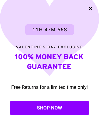
This popup will be triggered automatically a few seconds after the user lands on the page. It will be positioned at the bottom right corner so it doesn’t cover the page’s content. This will ensure that the user is focused on their primary goal of browsing your site. The copy of the popup should be “100% Money Back Guarantee with Free Returns for a limited time only!” and prominently displayed.
The popup should also have a prominent closing button (x) to be easily dismissable if the user does not interest in the offer. When the user closes the popup, it will use a cookie to remember the user’s choice. This will ensure the user is not bombarded with the same message multiple times. Limiting the impressions per user of the popup is recommended so it won’t be too aggressive.
Another key element of the popup is a countdown timer. This will increase urgency and encourage users to take advantage of the offer before it expires. Finally, a CTA link labeled “Shop Now” should point to the eshop homepage. This will make it easy for customers to take advantage of the offer and purchase immediately.
Encourage People to Follow on Valentine’s Day with a Slide-in Popup
Encouraging people to follow your business on social media can be a powerful way to boost your sales and increase brand awareness, especially during Valentine’s Day. By using a slide-in popup to promote your social media profiles, you can:
- Build a larger, more engaged audience for your business
- Increase your reach and visibility on social media
- Encourage repeat visits and purchases from your customers
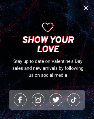
A slide-in popup effectively draws attention to your social media profiles as it slides in smoothly from the bottom right corner of the screen. This type of popup is triggered on user scroll; when the user has scrolled 50% of the page height, which is a good user experience, it will appear at the right moment. This way, you can ensure that many visitors see your message without being too intrusive.
The copy of the popup should be clear and concise and highlight the benefits of following your business on social media. For example, you might use the copy “Stay up to date on Valentine’s Day sales and new arrivals by following us on social media!” to encourage visitors to take action.
The closing button (x) should be prominent so that users can easily dismiss the popup if they choose to. This will help to improve the user experience, as users will feel in control of the popup and less likely to find it annoying.
In summary, using a slide-in popup to encourage people to follow your business on social media can be a highly effective way to boost your sales and increase brand awareness during Valentine’s Day. By triggering the popup at the right moment, highlighting the benefits of following you, and making it easily dismissable, you will create a positive user experience that will increase the chances of converting visitors into followers.
If you’re using WordPress, you can create a scroll popup in WordPress with a few clicks!
Promote Valentine’s Day Sale with a Heart-Shaped Popup Banner
It’s an excellent opportunity to increase sales around Valentine’s Day, but standing out from the crowd can also be challenging. One way to grab your customer’s attention is by using an unusual and eye-catching popup.
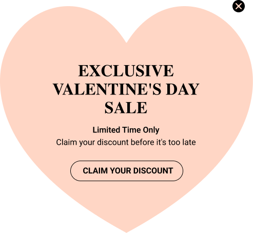
A heart-shaped popup is an effective way to promote your Valentine’s Day sale. It will automatically be triggered on the page load, ensuring your customers know your exclusive offer.
Here are some pros of using a heart-shaped transparent popup:
- It will catch your customers’ attention and make them more likely to click on the CTA.
- The transparent heart shape adds a Valentine’s Day touch to the popup, making it more fitting for the occasion.
- The heart shape gives a different look from the usual popups, making it more likely to be remembered by the customer.
The copy on the popup will be “Exclusive Valentine’s Day Sale, Limited Time Only. Claim your discount Now before it’s too late” It will create a sense of urgency, encouraging customers to act quickly.
The CTA button will have the label “Claim Your Discount” and clicking it will reveal a promo discount code. This will make it easy for customers to take advantage of your offer, and displaying the discount code will increase their chances of purchasing.
Frequently Asked Questions
What is the best WordPress Popup plugin to create Valentine’s Day popups?
The best WordPress popup plugin for creating enchanting Valentine’s Day popups is HeartPop. With its intuitive interface and a wide selection of pre-designed Valentine’s Day-themed popup templates, HeartPop empowers you to craft, customize, and launch captivating popups that will leave a memorable impression on your visitors. HeartPop is your secret weapon for making your Valentine’s Day marketing heartwarming!
Where can I find Valentine’s Day-themed popups for my WordPress site?
Look no further! FireBox’s Valentine’s Day Popup Templates library offers a variety of pre-made templates to jumpstart your marketing campaigns. With HeartPop, you can effortlessly access and tailor these templates to match your needs.
When to start promoting my Valentine’s Day deals?
It’s generally a good idea to begin promoting your Valentine’s Day deals at least a few weeks in advance. This will allow you to build anticipation and capture the attention of early shoppers. However, the exact timing may vary depending on your target audience and product offerings.
What are the common mistakes to avoid when using Valentine’s Day popups?
Some common mistakes to avoid when using Valentine’s Day popups include overwhelming your WordPress site with too many popups, creating popups that are not mobile-responsive, and not offering valuable incentives or relevant content in your popups. It’s also important to time your popups appropriately and avoid disrupting the user experience.
Should I use exit-intent popups for Valentine’s Day promotions?
Using WordPress exit-intent popups can be highly effective for Valentine’s Day promotions. When visitors are about to leave your site, these popups can offer last-minute deals or discounts, effectively reducing cart abandonment and increasing conversions.
What other seasonal campaigns should I incorporate into my marketing strategy?
In addition to Valentine’s Day campaigns, you should consider various other seasonal campaigns, such as those for Black Friday, Halloween, Cyber Monday, Christmas, New Year, and many more. These holidays provide exceptional opportunities to engage with your audience and increase sales.
Conclusion
In conclusion, using popups on your WordPress site can be a powerful way to boost conversions on Valentine’s Day. Whether you’re looking to create a sense of urgency, offer free shipping, or generate leads, a variety of popup templates can help you achieve your goals.
The Valentine’s Day popup templates outlined in this article can be a great starting point for your campaigns. But remember, you can also customize them to fit your brand and products. With the right approach, popups can help you make the most of the holiday season and drive sales for your online store.
So, don’t hesitate to try and see the difference it can make for your business.





0 Comments